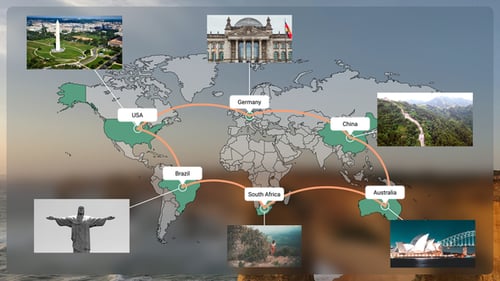
Infection map
By E_InfographicsOne great value subscription from €14.50/month
- Unlimited downloads of 27+ million creative assets
- AI Tools: video, image and more
- Lifetime commercial license
- Easy cancellation
Already have an account? Sign in
Attributes
- Length
- 5:00
- Resolution
- 1920 x 1080
- File Size
- 17.6 MB
- Application Supported
- After Effects
- Required Plugin
- None required
- After Effects Version
- CC
- Commercial License
- Further Information
Description
Visualize global health data with this dynamic world map template. It displays infection, recovery, and death statistics across various countries, using a color-coded system to indicate varying levels of data. The clean, flat design ensures clarity and readability, making complex data easily digestible. Perfect for news broadcasts, scientific presentations, or educational content requiring a visual representation of worldwide phenomena. Easily customize data for each country and toggle visibility of country names and counts to tailor the map to specific informational needs.
Audio used in this item