Animated Pie Chart Data Analysis Infographic Presentation
By lucadpOne great value subscription from €14.50/month
- Unlimited downloads of 27+ million creative assets
- AI Tools: video, image and more
- Lifetime commercial license
- Easy cancellation
Already have an account? Sign in
Attributes
- Length
- 0:13
- Resolution
- 3840 x 2160
- File Size
- 915 MB
- Frame Rate
- 30 fps
- Alpha Channel
- No
- Looped
- No
- Video Encoding
- ProRes
- Orientation
- Horizontal
- Commercial License
- Further Information
Description
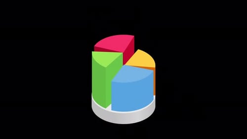
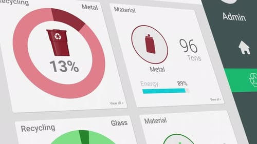
The animation features a dynamic pie chart that incrementally builds, revealing proportional data segments in shades of blue and orange. The central text "Data Analysis" is surrounded by these evolving segments, which animate with a modern, geometric aesthetic. Subtle background UI elements, including numerical readouts and bar graphs, provide context for data visualization. This animated infographic is perfect for enhancing business presentations, financial reports, and educational materials, offering a professional and engaging way to represent complex information and statistics. It helps to clearly illustrate market shares, survey results, or performance metrics.